From raw data to decisions you own.
Omniscope lets you connect, prepare, analyse and visualise your data, then deliver trusted outputs without stitching separate tools together.
Build verifiable, explainable insights and data workflows faster with frontier and local LLMs.
Run it in your cloud or on-premises for full control and data privacy.
Sign up for a free trial on our cloud.
Or download and try it on your local machine.

One workspace for
the whole data journey.
Omniscope lets you connect, prepare, analyse and visualise your data, then deliver trusted outputs, without stitching separate tools together.
Build verifiable insights faster with any LLM.
Deploy privately in your cloud or on-prem.

Powering businesses worldwide


The problem
Where data work breaks.
Recognise any of these? See how Omniscope turns scattered data work into visible, repeatable workflows you can trust and control.
Messy inputs
Data arrives incomplete, duplicated, inconsistent or trapped in awkward formats.
Clean, usable data
Preparation becomes visible and repeatable. Clean, reshape and validate real-world data before it reaches dashboards, reports or AI.
Omniscope brings data preparation, transformation, visualisation, and delivery together.
Raw or fragmented data becomes trusted reports, self-service analytics, and automated outputs.


Empowering every data role, from pipeline to insight

Data Managers
Build and manage pipelines to pull, transform and push data across systems.

Data Scientists
Leverage built-in AI & ML or plug in your models to augment your workflows.

Data Analysts
Explore any data, discover insights to make data-driven business decisions.

Building blocks for data integration and transformation
Integrate and explore any data, and build your data pipeline.
Extract and process big data. Transform, combine, prepare, clean. Use in Omniscope’s visualisations, or export to another system.
Build workflows adapting to conditions to act like AI agents – to reason and adapt.
Data sources include:
Excel, CSV, JSON, XML, Parquet, Avro
Google Analytics, DoubleClick, Campaign Manager, Sheets
Salesforce, Twitter, Reddit
HTTP API, Email, SSH
Custom connectors (Python / R)
SQL databases
Snowflake, Databricks, Hadoop, Elasticsearch
Actian Vector, Impala
Google Cloud Storage, Azure Gen2 Storage
Amazon Redshift, S3
Intelligent analytics & AI models
Chat with AI to design your custom block, extract insights, analyse your data, or leverage LLMs like OpenAI GPT for data classification and summarisation.
Use the core Omniscope machine learning blocks to do advanced analytics the right way.
Regression
Clustering
Seasonality
Basket analysis
Prediction, Forecasting
Covariance/correlation
Topic modelling
Network analysis
One Way ANOVA
Variable Importance
Dimensionality reduction
Oversampling
Omniscope is extensible: build your own blocks in Python and R, bundle and organise your blocks library.


Integrated visualisations
Explore your data in our dynamic interactive views.
Filter, select, isolate, drill-down. Design dashboards and share reports.
Empower users to instantly transform data into reports.
Enable your audience to drag and drop multiple data files to build a dashboard using project templates.
Build your own custom JS views and web components.
With our Custom View API, use any client-side HTML5 and JS framework or library you like – your views will filter and cross-tab automatically.
Design a custom web UI for your Omniscope powered data apps.
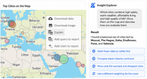
LLM-powered dashboards and verifiable data exploration
- Automated Dashboards with Report Ninja — Generate custom dashboards in one shot with the Instant Dashboard block.
- Insight Explorer / Data Q&A — Ask natural-language questions and get meaningful charts, summaries and data answers.
- Explainable & Verifiable AI — Inspect assumptions, queries, transformations and chart logic behind each answer.
- Reusable Results — Save, export or promote verified AI answers into reusable report components.
- Flexible AI Model Support — Choose between commercial AI solutions (e.g. OpenAI’s gpt-5) or local models (e.g. gpt-oss on llama.cpp and vLLM) for full privacy.

")
Without Omniscope
😖 Data, logic and reporting are scattered
Data sits in different systems and files. Logic is copied across tools and reports, leaving no clear process to trust.
😵💫 Messy data slows everything down
Data arrives inconsistent or in awkward formats. Most tools expect clean data, so you spend hours fixing data first.
🔍 Numbers are hard to trace
When a figure changes, teams struggle to see where it came from, what changed, or which version is right.
⏳ Reporting stays manual
Teams rebuild the same checks, exports, dashboards and reports again and again.
🚧 Prototypes get rebuilt
Quick analysis proves value, but often has to be rebuilt before it can be shared, automated or governed.
🤖 AI becomes another black box
AI can produce answers fast, but the data, logic and assumptions behind them are hard to verify.
🆘 Support is distant
Complex workflow problems get pushed through tickets, forums, consultants or canned replies.
")
With Omniscope
🥇 One visible workflow
Data, logic, analysis and reporting live together in one connected process. Teams get a shared source of truth they can inspect, reuse and trust — from raw inputs to final outputs.
🧹 Built for messy real-world data
Bring together data from different systems, files and formats. Clean, reshape, validate and enrich imperfect data before it reaches dashboards, reports or AI-assisted analysis.
🧭 Trace every result
See how each number was created, which steps changed it, and which logic produced the output. When data changes, teams can follow the path instead of guessing.
⚙️ Automate repeatable work
Turn recurring checks, transformations, reports, exports and deliveries into reusable automated workflows. Reduce manual reporting effort and make outputs easier to maintain.
🚀 Prototype and scale in one product
One skilled person can explore an idea, build the workflow, create outputs and prove value quickly. The same work can then become a shared, scheduled and governed process.
🤖 Verifiable AI, not another black box
Use AI to explore data, generate reports and surface insights — while keeping the data, logic, prompts, assumptions and workflow around each answer inspectable, reusable and governed.
🛟 Speak to the builders
Get practical guidance from the Visokio team — the people who build Omniscope. No generic support layer, just direct expertise to help with real-world workflows.


Omniscope is…

Universal
A fresh and smart UX on any device: Windows, Mac, Linux, Android, iOS.

Extensible
Augment workflows with Python / R scripts; enhance reports with JS dataviz.

Scalable
Prepare Big Data with streaming ETL; Build Live Query dashboards on SQL databases.

Collaboration
Multi-user live edits to collaborate on workflows and dashboards. Version history and working copies to develop and manage changes with peace of mind.

Automation
Schedule data refresh and report updates, trigger tasks and alerts. Plenty of REST API to automate data flows, edit and query data, reconfigure dashboards.

Security
Deploy on-premises, or on your cloud. Built-in multi-site user permissions. SSO with OpenID Connect identity verification (Google, Okta, Auth0, Keycloak, Entra ID).
While Omniscope is a tool for analysts and teams to prepare, explore, and visualise data, it is also a fully customisable white-label solution.
It enables businesses to seamlessly integrate analytics, data visualisation, and BI features directly into their own software — branded as their own — without the cost, time, or complexity of building them from scratch.
Struggling to add analytics and BI to your platform?
Say hello to Omniscope!
- Save Time and Resources: Avoid lengthy development cycles and the high costs of building analytics features yourself.
- Quick Integration: Get to market faster by seamlessly embedding Omniscope into your existing platform.
- Customisable & White-Labelled: Tailor Omniscope to match your brand identity, so it feels like a natural extension of your software.
- Focus on your Core Product: Let your team focus on improving your core offering while we handle the analytics.
Let’s partner to take your platform to the next level — contact us to embed Omniscope effortlessly.
Explore demos and data solutions

Data storytelling on how to visualise geographic time data – Analysis of the water quality in Europe

Demo showing a standard portfolio breakdown complete with year-on-year and month-on-month performance KPI’s

Kaplan-Meier survival curves to compare treatments across hospitals, using different survival analysis models

Dashboard to monitor & visualise cryptocurrency flows between exchanges and unknown entities on different Blockchain networks.


Harvesting and harmonising Premier League historic data, visualising stats and results

Wine collection is clustered according to characteristics such as chemistry and colour, using K-Means, DBSCAN and Gaussian Mixture Modelling

Spend management dashboard with classification and breakdowns, with Sankey and Pareto views.

Analysing data from two unrelated advertising campaigns in the same report. Independent and combined filtering applied.

Showing truck delivery routes and quantities of pallets delivered to customers, including the delay breakdown.

The call center dashboard tracks CSAT and CRM data, analysing agent performance, queue management and customer interactions.

Analysing trading volume/price correlation of a security.
In this demo we focused on price of Bitcoin, Ethereum and Leo, attempting a time-series analysis as explained by this blog post

Simulating the effects of social distancing and isolation, asymptomatic and positive cases, lethality of the Covid-19 and region population density.

Collections of web dashboards to help analyse and explore the Coronavirus pandemic outbreak, worldwide and in specific countries.

Exploiting public data to build a monitoring dashboard. Measuring air pollution and trigger data alerts.
An example of data democratisation to put a spotlight on public health. Full article on Medium.
Customer success stories

Veolia
OMNISCOPE比TABLEAU好用 用户界面简单易学,操作流程简捷,通过浏览器可以随处对应用程序进行更新。 这个软件功能强大,每个版本都有许多新增的功能,而且可以在流程中直接写PYTHON/R和JAVA SCRIPT,报表可以直接触发应用程序的运算和更新。 更重要的是,这个软件有及时和高质量的技术支持,我的问题每次都及时地传给不同的部门得以解决。 虽然市场上大数据的软件很多,我个人觉得OMNISCOPE同时为程序开发者和程序使用者提供了很好的功能,你可以自己在https://omniscope.visokio.com/ 试一下。

Avizua
I discovered Omniscope nearly twenty years ago, while working at the CNRS, in the ‘Sales Analysis’ department of INIST Diffusion.
At the time, we were testing numerous data analysis tools, which were often powerful but time-consuming. We had to wait for lengthy calculations, sometimes only to find that the result was incorrect... and start all over again.
Then I discovered Omniscope. It was a revelation.
The tool was already different from the others: intuitive, fluid, fun. Preparing data in the form of a visual workflow transformed the way we worked. We were able to automate our processes without any technical skills, and a report that used to take five weeks to produce could now be produced in three days.
I often said at the time that I was ‘getting paid to have fun’ because using Omniscope reminded me so much of building with Lego.
Over time, I also discovered the deeply human side of Visokio. Regular exchanges with Aimée and Edward Forbes, the founders of Visokio, and then with the whole team, gave rise to a genuine relationship of trust. This kind of closeness is rare in the world of software publishers.
In 2012, I wanted to introduce Omniscope to French professionals and share this unique approach to data. That's why I founded AVIZUA. Since then, I have been helping my clients analyse, visualise and exploit their data through Omniscope.
What I particularly like about this tool is its perfect balance between power and simplicity. Omniscope is comprehensive, intuitive and adapts to each user, regardless of their technical level.
But above all, Omniscope is constantly evolving: Visokio listens to its users and develops the product according to their real needs. On several occasions, I have made suggestions for improvements and seen them implemented a few weeks later.
This responsiveness, passion and attentiveness are, in my opinion, the hallmarks of Visokio.
It's also what makes me feel, even today, a bit like part of the family.
I feel completely in tune with the whole team. And that's probably why, after all these years, I never tire of it.
Smart DCC
I’ve been using Omniscope for over 7 years now, from the original Classic version to the new and much improved Evo versions. The capability by not only the product and team have exceeded any expectations. We deployed Omniscope to support the rollout of smart metering across the UK when we created a data science and analytics capability with Omniscope to support our ETL, analytics, reporting, presentation layers. The highlights being that the solution is now written into the UK smart metering licence and it was also instrumental in myth busting perceived supplier and system issues. The Visokio team have been instrumental in supporting the rollout with consultancy, support, training and guidance at all levels.


About Visokio
Founded in 2002 in London, we evolved into a fully remote distributed team, building powerful tools to help people make sense of data.
We work closely with our clients – shaping data solutions and evolving Omniscope together to meet real-world needs.
What does “Visokio” mean?
The name Visokio combines two core ideas at the heart of what we do. “Vis” comes from visualisation, and “okio” echoes occhio – the Italian word for eye.
Together, they express our mission: to help people see and understand their data. Just like our eye-shaped logo, the name reflects our belief that insight begins with vision – and that turning data into something visible and intuitive empowers better decisions.
Join the team
We are always looking for talented and driven people in software, business development and commercial areas, so if this is you, get in touch.
Would you like an app tour? Need a proof of concept on your use cases? We are here to help!
Your free trial is over? Ready to get value from your data? Get an Omniscope licence!